I create clear, intuitive designs that feel natural and make your product easier to use.
Open collaboration that turns your vision into focused UI/UX, pitch decks, design systems, and branding style guides you’ll actually love using.
Book A CallFeatured Work
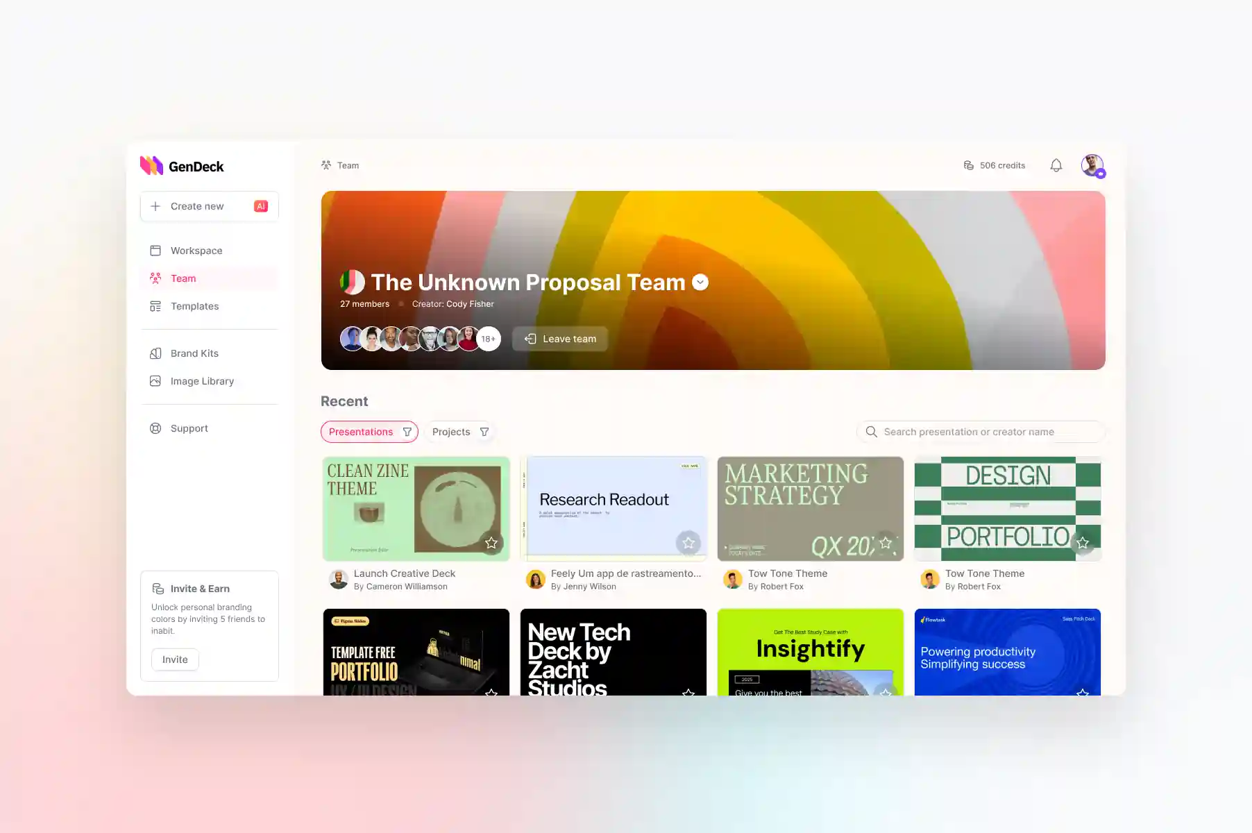
GenDeck – AI-Powered Presentation Platform
GenDeck is a SaaS platform that enables users to create high-quality presentations in minutes. The problem: non-designers spend hours in PowerPoint only to achieve mediocre results. Scale target: 10k+ monthly active users, global audience.
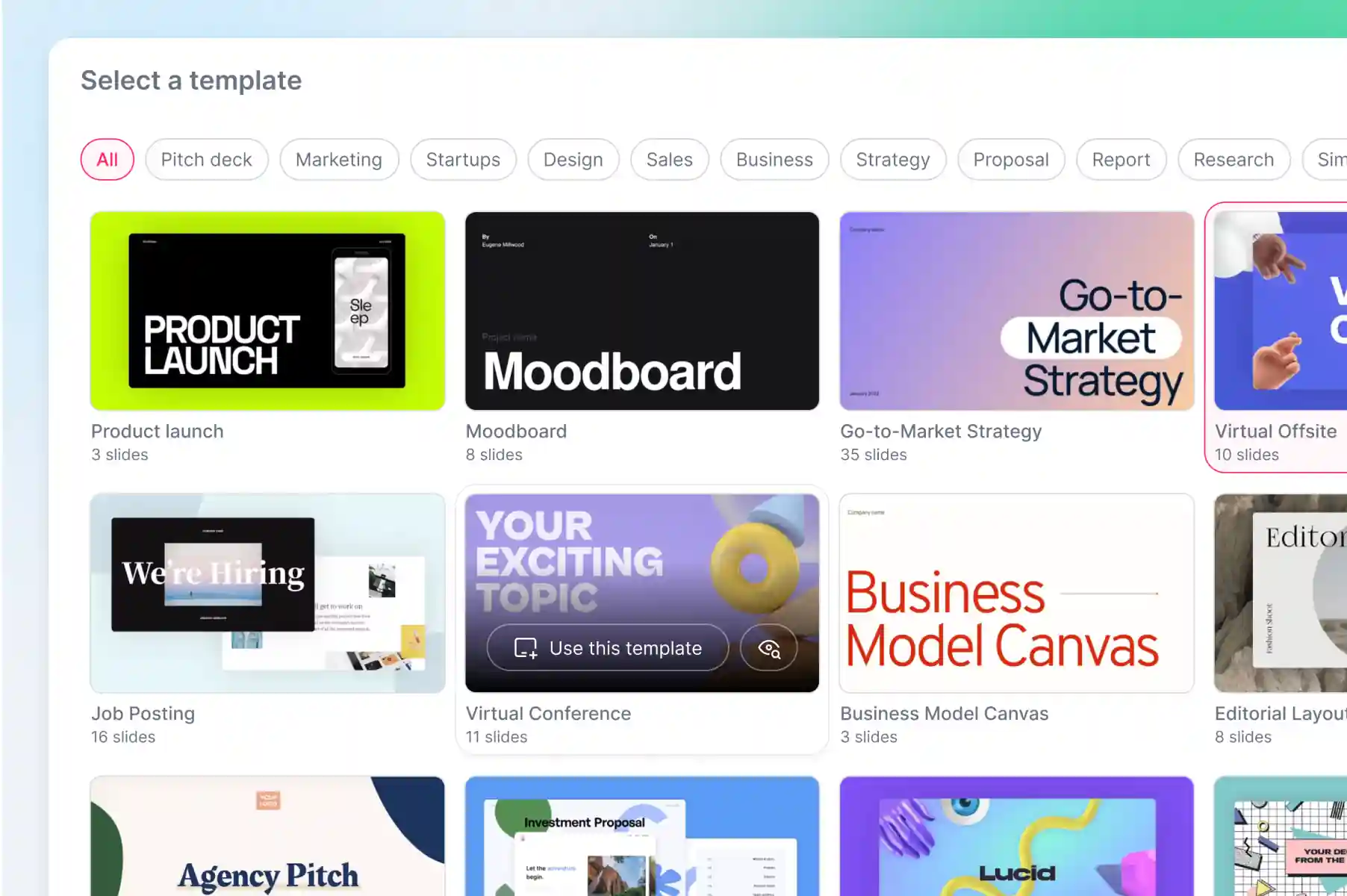
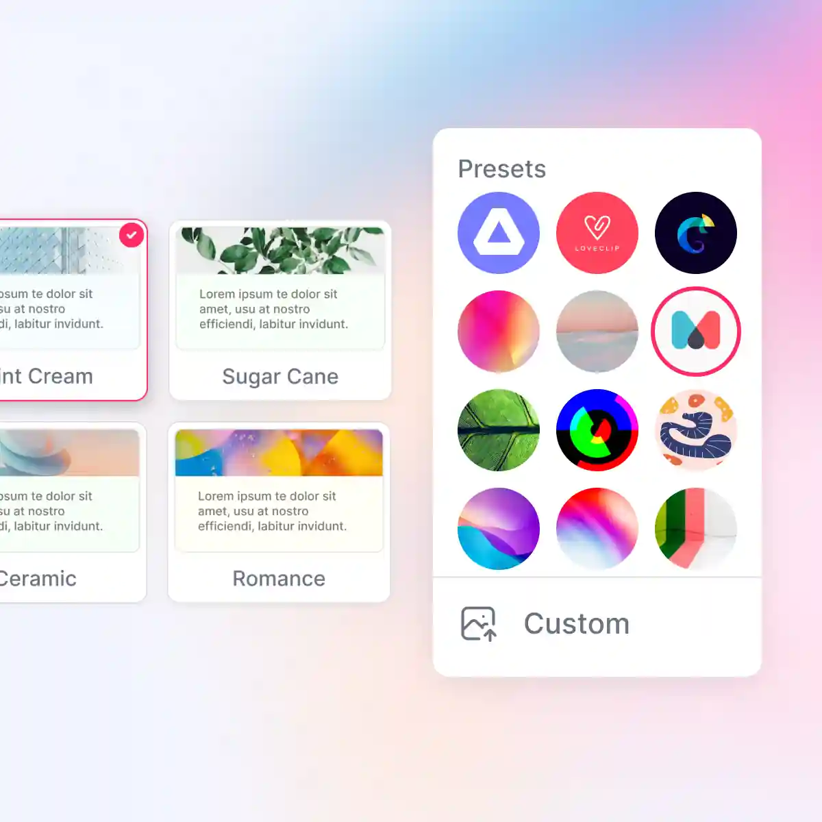
Template Discovery System
Redesigned template selection from 12-step wizard to 4-step contextual flow (role-based, industry-based filtering).
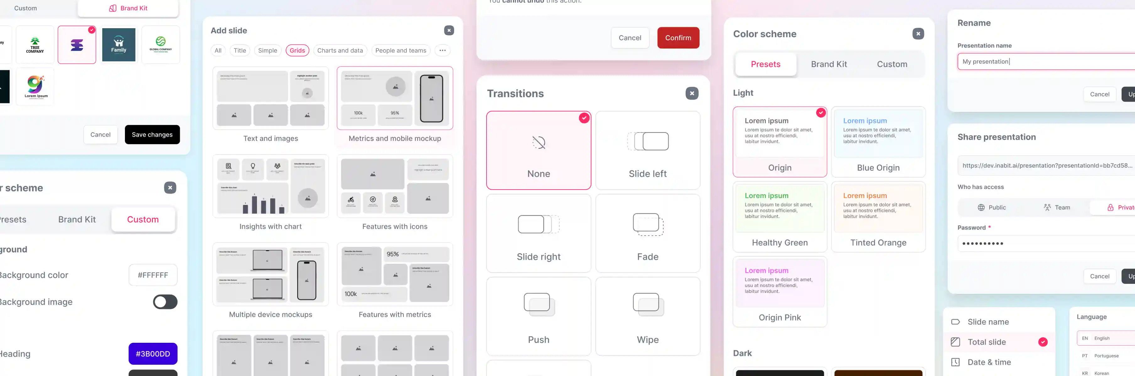
Collaborative Slide Editor
Built real-time collaborative interface with live cursor tracking, comment threads, and version history. Designed mobile-optimized editor (not just responsive — purpose-built for touch interactions).
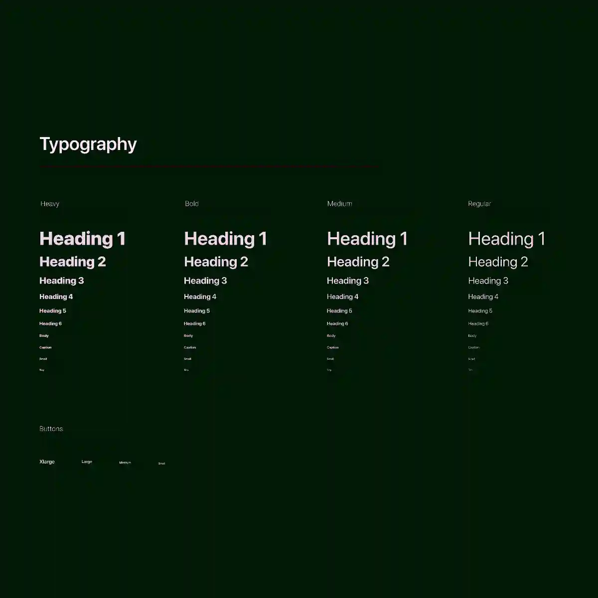
Design System Implementation
Created 40+ reusable components (buttons, cards, inputs, modals) with consistent spacing grid (4px base), typography scale (12-32px), and color system (8 primary colors + semantic palette). Ensured WCAG AA compliance across all interactive elements
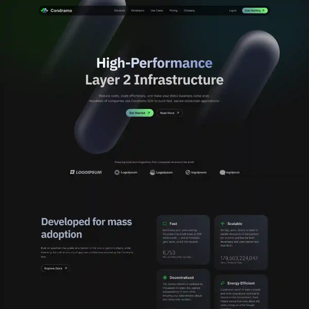
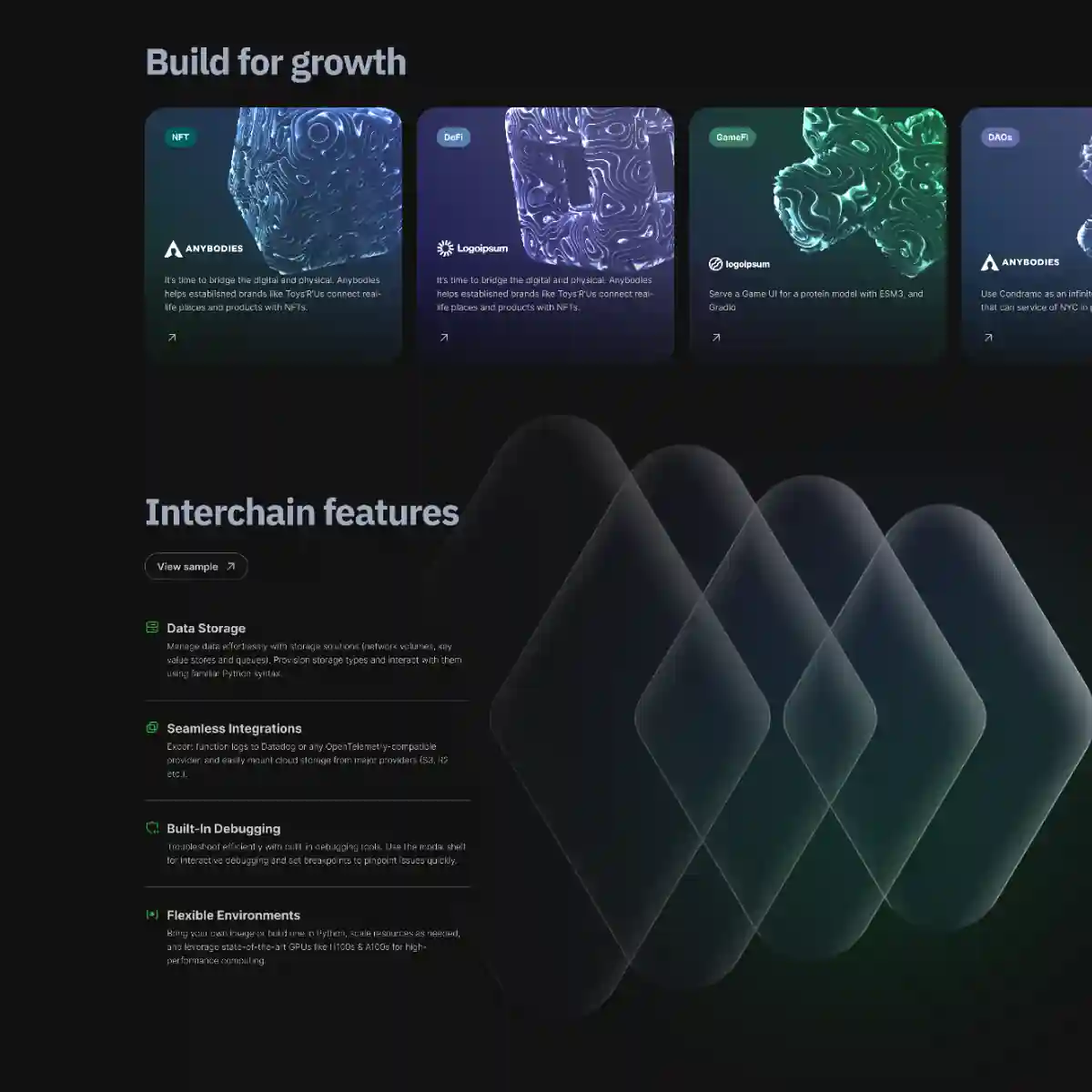
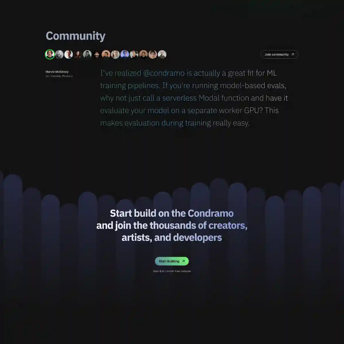
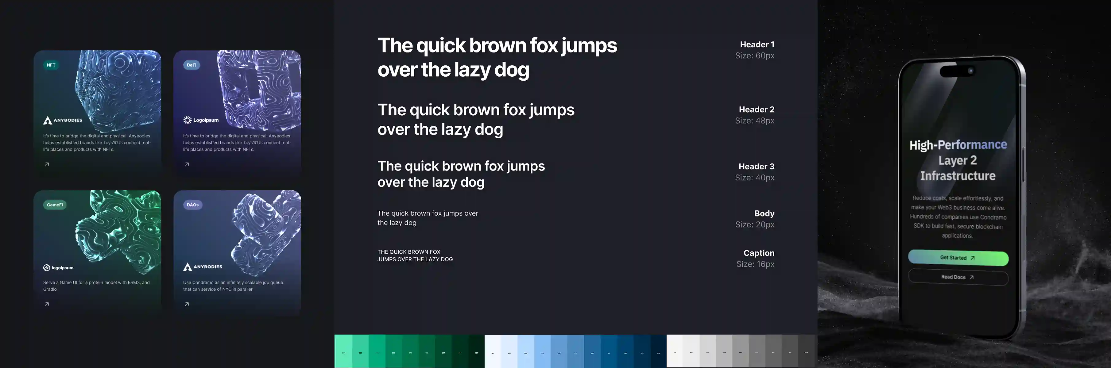
Condramo – Landing Page Design
Condramo is a Layer 2 blockchain infrastructure platform—think Arbitrum or Optimism—targeting developers building on Ethereum.
Landing Page Design
Designed a high-converting, premium dark-mode landing page positioning Condramo's Layer 2 infrastructure as the developer-first, high-performance alternative to Arbitrum and Optimism.
Design System for Technical Clarity
Dark palette (near-black + teal/green accents): Established trust, reduced cognitive load for dense content. Feature cards with metric-first layout: Used data visualization (6,753 TPS, 170,523,234,047 volume) instead of adjectives
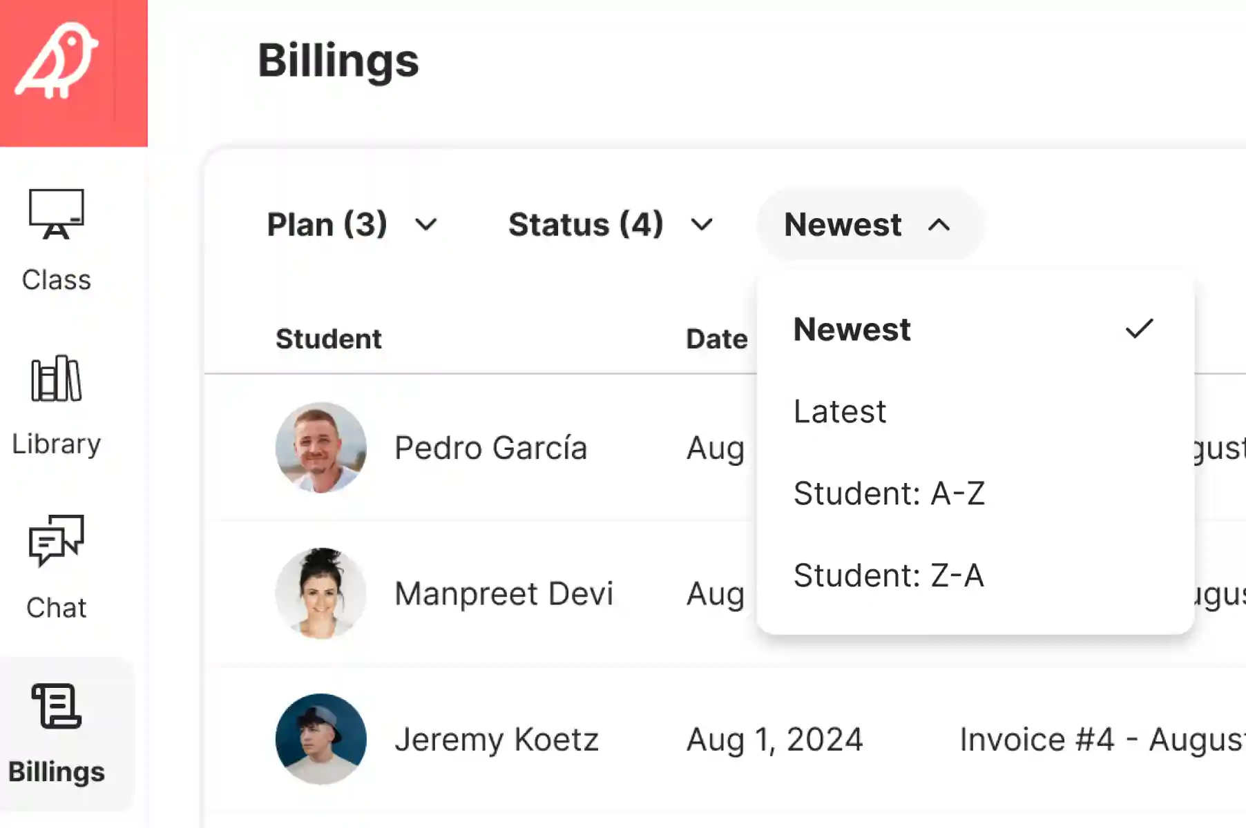
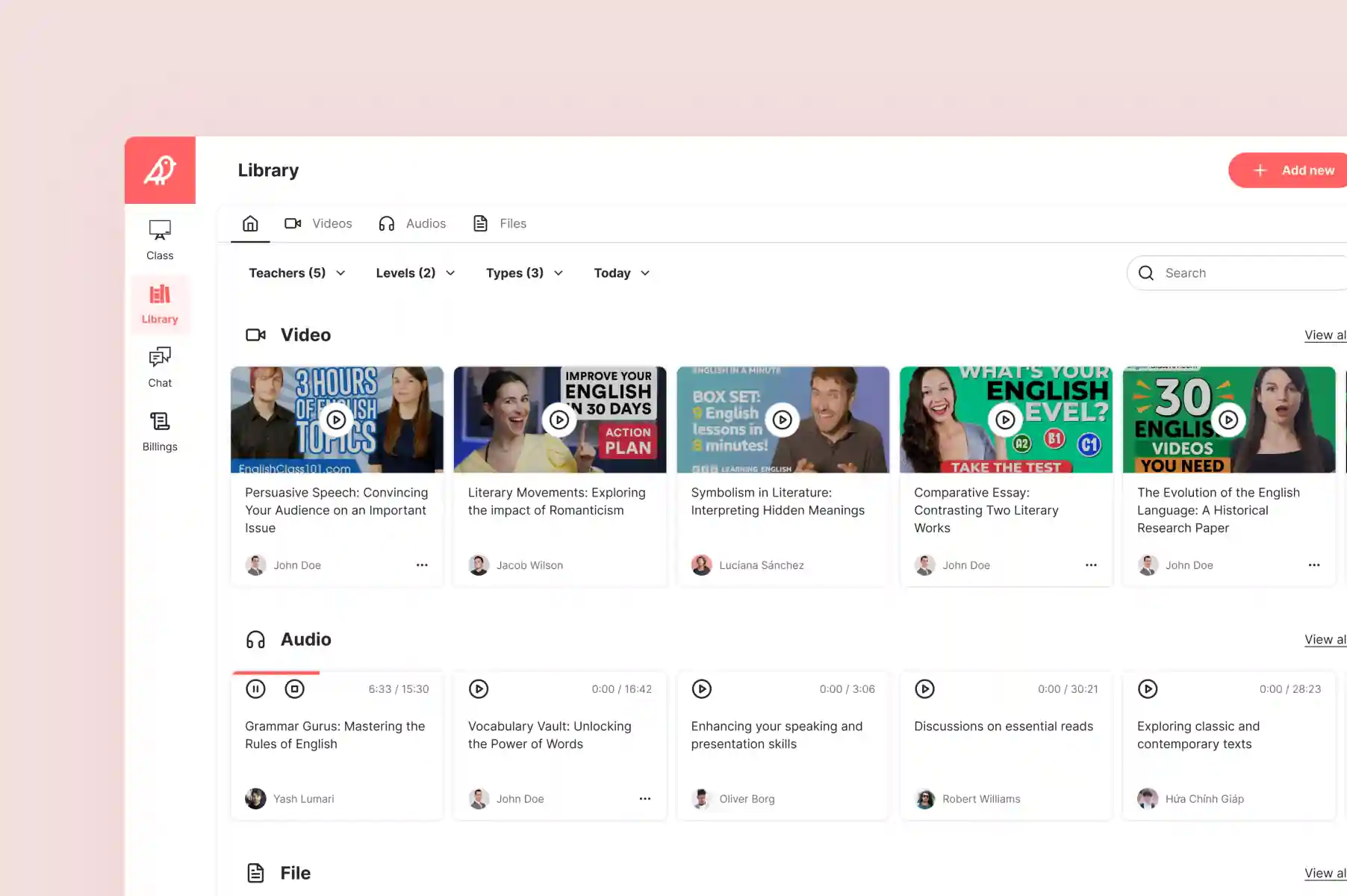
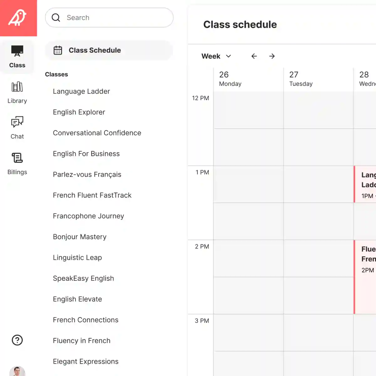
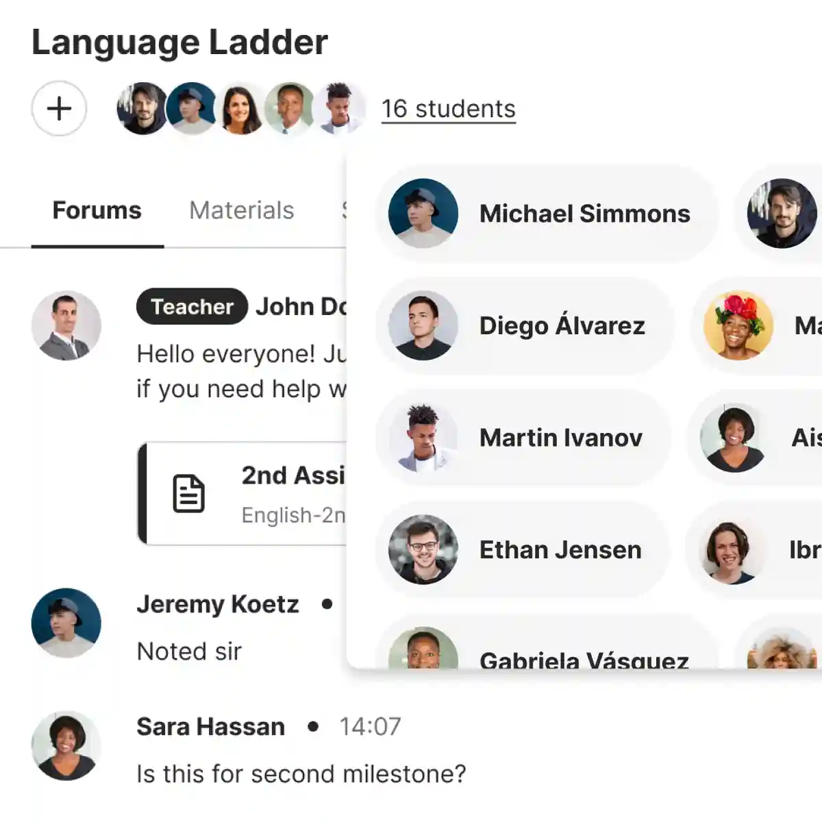
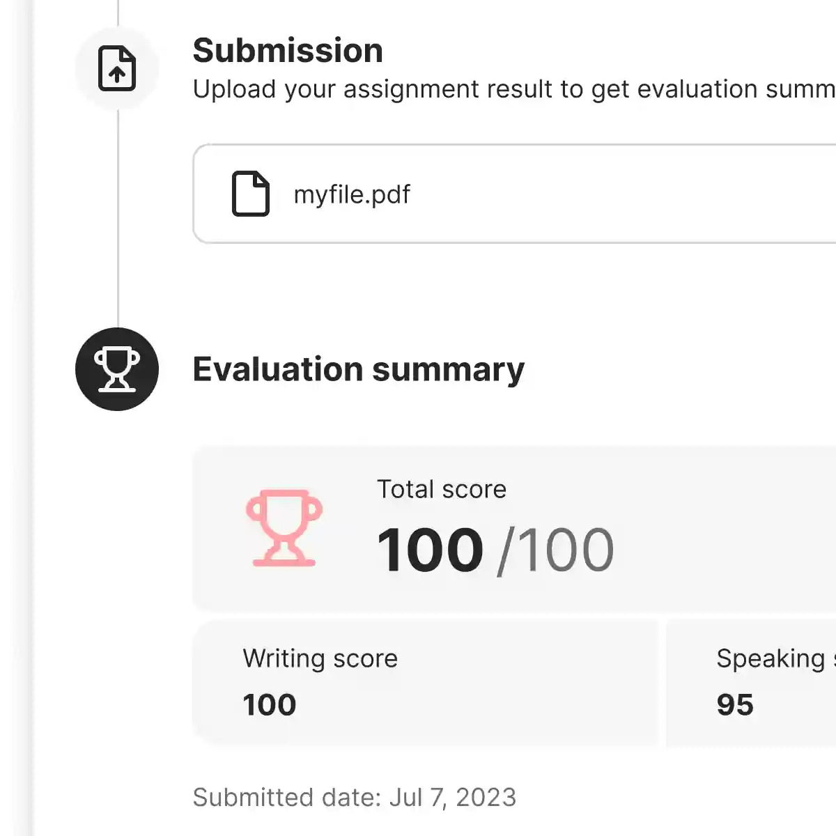
Sotaque – Modern SaaS platform for language teachers
Sotaque is a complete digital classroom built specifically for English and French language instructors. It brings together course management, live classes, student tracking, content library, assignments, real-time chat, and feedback — all in one beautiful, intuitive dashboard. The goal was to replace the messy mix of Zoom, Google Classroom, WhatsApp, and email that most freelance and institutional teachers were juggling.
- Conducted stakeholder interviews and mapped user journeys for both teachers and students.
- Designed a complete design system with a warm, modern visual language (soft coral accents, clean cards, generous whitespace).
- Built the core classroom experience: Class Schedule calendar, Materials Library (video/audio/file), Student Track with submission cards, real-time Chat, Forums, and the milestone system.
- Created the full onboarding flow — from “Register as English/French teacher” to profile setup with photo upload and milestone selection.
- Designed key micro-interactions: assignment upload with drag-and-drop, emoji-based course feedback modal, and inline audio/video players.
- Delivered responsive web designs + detailed component specs for the development team.
My Approach
Design Strategy For Products at Scale. Built on research, accessibility standards, and measurable outcomes.
Serious products need serious design. I work with tech teams building products for global audiences—helping them navigate complex user needs, accessibility standards, and multi-platform coherence. My approach combines strategic thinking with pixel-perfect execution: every design decision is informed by user research, accessibility audits (WCAG), and competitive analysis. The result? Products that feel purposeful, scale smoothly, and earn user loyalty.
SPECIALITIES
Product Design
UI/UX Design
Design System
Functional Prototypes
MVP Sprints
I DESIGN
Desktop Apps
Mobile Apps
Website
Branding Style Guide
Pitch Decks